Style Guide MVC
Need to Hide Something?
Use the word "hidden" in a layout block under the row.
Layout
Containers
This layout column has a max width (the content within does not strech to the edge of the browser on wide viewports).
Use a container class on a layout column to apply the sites' standard max width restriction.
This layout column has a wider area, typically used for images or multiple columns..
Add section to the wrapper and container and container-wide class on the same column to widen the max-width restriction.
This layout column has a more comfortable reading line length.
Add section to the container and container and reading-container-rebrand class on the same column to shorten the max-width restriction.
This layout column is more narrow.
In addition to the container class, also use a reading-narrow class on the same column to shorten the max-width restriction.
This layout column has the most narrow max width of all.
In addition to the container class, also use a reading-slim class on the same column to shorten the max-width restriction.
Layout Spacing
NOTE: ^ If you are using columns with a `gutter` class make sure to first wrap those columns in a layout element with a children-with-gutters class (this will help align the columns with the rest of the page content).
Divided columns
Drop in a multi-column layout block and add a divided-columns class to the wrapper.
Add a equal-heights class if you want the columns to appear equal in height.
Add a center-inside class if you want the content within the columns to be vertically centered.
Typography and Colors
Sizing
Font Sizes - type is Roboto Slab
Heading 1
Heading 2
Heading 3
Heading 4
Heading 5
Heading 6
Normal Text
Text size options
This is some normal text. This is some normal text. This is some normal text. This is some normal text. This is some normal text.
Use a small-text class for some small text. This is some small text. This is some small text.
Use a medium-text class for some medium text. This is some medium text. This is some medium text.
Use a large-text class for large text. This is some large text. This is some large text.
Use a larger-text class for some larger text. This is some larger text. This is some larger text.
Use a largest-text class for the largest text.
HEX Color Codes
FMI Logo Green: #3aa547.
Green Bright: #0db02b
Orange: #cc5b34
Blue: #007bc1
Light Blue: #00ADEF
Dark Blue: #403b7a
Light Grey: #f5f5f5
Dark Grey: #262c30
Red: #920b34
Complimentary Colors:
Blueberry: #0364af
Mustard: #fcd54d
Cider: #dc1854
Artichoke: #98bf85
Cinnamon: #966e10
grape: #71347f
lavendar: #7d7bad
Cherry: #dc1854
"Banded" areas
The default background of the site is a light gray color.
Add a banded-bright class to a layout element to make the background white.
Navigation
When using a navigation widget:
- Go into the widgets' advanced settings
- For the SiteMapProviderName option set: CustomSitefinitySiteMap - Setting this option will enable protected pages to display in the navigation.
Horizontal Lists
add a list-across class to a list to make it display horizontal.
- I am a list item
- I am also a list item!
<ul class="list-across">
	<li>I am a list item</li>
	<li>I am also a list item!</li>
</ul>
add a list-across-divided class to a list to make it a divided horizontal list.
- I am a list item
- I am also a list item!
<ul class="list-across-divided">
	<li>I am a list item</li>
	<li>I am also a list item!</li>
</ul>
Mobile Display
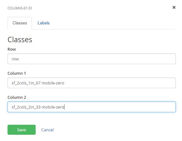
If for some reason layout elements don't stack on mobile - add a mobile-zero class to the layout element.
Buttons
<ul class="list-across">
	<li><a href="#" class="button">Hello world</a></li>
	<li><a href="#" class="button-secondary">Hello world</a></li>
</ul>
To make buttons bigger add a button--big class.
<ul class="list-across">
    <li><a href="#" class="button button--big">Hello world</a></li>
    <li><a href="#" class="button-secondary button--big">Hello world</a></li>
</ul>
Banded buttons
Pull quote standard
Lorem ipsum dolor sit amet, consectetur adipiscing elit. Curabitur dapibus vehicula dignissim. Fusce placerat tincidunt egestas. Ut nec urna vitae sapien varius pulvinar. Pellentesque varius metus non mi tristique consectetur. Aliquam purus tellus, lobortis vitae mi a, imperdiet pharetra ligula. Interdum et malesuada fames ac ante ipsum primis in faucibus. In tempor nibh ligula, in posuere ex auctor quis. Quisque ac nibh venenatis, dapibus nisl nec, tincidunt ligula.
    <blockquote>
Lorem ipsum dolor sit amet, consectetur adipiscing elit. Curabitur dapibus vehicula dignissim. Fusce placerat tincidunt egestas. Ut nec urna vitae sapien varius pulvinar. Pellentesque varius metus non mi tristique consectetur. Aliquam purus tellus, lobortis vitae mi a, imperdiet pharetra ligula. Interdum et malesuada fames ac ante ipsum primis in faucibus. In tempor nibh ligula, in posuere ex auctor quis. Quisque ac nibh venenatis, dapibus nisl nec, tincidunt ligula.<footer>-Etiam vel dictum tellus.</footer>
</blockquote>
Pull quote without quote icons
Lorem ipsum dolor sit amet, consectetur adipiscing elit. Curabitur dapibus vehicula dignissim. Fusce placerat tincidunt egestas. Ut nec urna vitae sapien varius pulvinar. Pellentesque varius metus non mi tristique consectetur.
Aliquam purus tellus, lobortis vitae mi a, imperdiet pharetra ligula. Interdum et malesuada fames ac ante ipsum primis in faucibus. In tempor nibh ligula, in posuere ex auctor quis. Quisque ac nibh venenatis, dapibus nisl nec, tincidunt ligula.
    <blockquote class="unquoted">
Lorem ipsum dolor sit amet, consectetur adipiscing elit. Curabitur dapibus vehicula dignissim. Fusce placerat tincidunt egestas. Ut nec urna vitae sapien varius pulvinar. Pellentesque varius metus non mi tristique consectetur. Aliquam purus tellus, lobortis vitae mi a, imperdiet pharetra ligula. Interdum et malesuada fames ac ante ipsum primis in faucibus. In tempor nibh ligula, in posuere ex auctor quis. Quisque ac nibh venenatis, dapibus nisl nec, tincidunt ligula.<footer>-Etiam vel dictum tellus.</footer>
</blockquote>
Pull quote - small variations
Lorem ipsum dolor sit amet, consectetur adipiscing elit. Curabitur dapibus vehicula dignissim. Fusce placerat tincidunt egestas. Ut nec urna vitae sapien varius pulvinar. Pellentesque varius metus non mi tristique consectetur. Aliquam purus tellus, lobortis vitae mi a, imperdiet pharetra ligula. Interdum et malesuada fames ac ante ipsum primis in faucibus. In tempor nibh ligula, in posuere ex auctor quis. Quisque ac nibh venenatis, dapibus nisl nec, tincidunt ligula.
    <blockquote class="small">
Lorem ipsum dolor sit amet, consectetur adipiscing elit. Curabitur dapibus vehicula dignissim. Fusce placerat tincidunt egestas. Ut nec urna vitae sapien varius pulvinar. Pellentesque varius metus non mi tristique consectetur. Aliquam purus tellus, lobortis vitae mi a, imperdiet pharetra ligula. Interdum et malesuada fames ac ante ipsum primis in faucibus. In tempor nibh ligula, in posuere ex auctor quis. Quisque ac nibh venenatis, dapibus nisl nec, tincidunt ligula.<footer>-Etiam vel dictum tellus.</footer>
</blockquote>
Pull quote - left and right aligned variations
Lorem ipsum dolor sit amet, consectetur adipiscing elit. Curabitur dapibus vehicula dignissim. Fusce placerat tincidunt egestas. Ut nec urna vitae sapien varius pulvinar. Pellentesque varius metus non mi tristique consectetur. Aliquam purus tellus, lobortis vitae mi a, imperdiet pharetra ligula. Interdum et malesuada fames ac ante ipsum primis in faucibus. In tempor nibh ligula, in posuere ex auctor quis. Quisque ac nibh venenatis, dapibus nisl nec, tincidunt ligula.
Etiam vel dictum tellus. Vestibulum eu tempor quam, nec finibus erat. Nullam ut blandit augue. Nullam nec malesuada elit. Sed eu rutrum velit, et vestibulum justo. Sed accumsan pulvinar libero a euismod. Nulla quam velit, dapibus ac feugiat sed, porta in odio. Nam a velit elementum, dignissim mauris in, fermentum dolor. Praesent fermentum bibendum nibh, vel cursus justo egestas scelerisque. Donec nec volutpat arcu. Donec et pretium mauris. Maecenas vel libero tincidunt, ullamcorper urna ac, ornare erat. Suspendisse et commodo tortor.
Lorem ipsum dolor sit amet, consectetur adipiscing elit. Curabitur dapibus vehicula dignissim. Fusce placerat tincidunt egestas. Ut nec urna vitae sapien varius pulvinar.
Donec feugiat nunc sit amet odio ultrices condimentum. Nam tincidunt magna ut lacinia placerat. Mauris tristique tempor mauris, sit amet vulputate augue lobortis vel. Suspendisse quis justo sapien. Sed quis lorem libero. Cras porttitor euismod erat. Vestibulum mi eros, mattis eget leo in, tristique fermentum nunc. Aliquam eu facilisis justo. Sed eget purus malesuada, faucibus nunc in, ultrices justo. Integer id velit sed sem porttitor ultrices auctor sit amet nisl. Nunc ultricies augue vitae varius fringilla. Suspendisse ornare magna ut dui auctor bibendum eu id nisl.
Integer in dictum sapien. Phasellus nec libero vestibulum ante porta feugiat. Curabitur gravida diam odio, ut facilisis eros finibus in. Pellentesque vulputate commodo pulvinar. Donec orci est, eleifend non leo quis, scelerisque rutrum eros. Vestibulum elementum est ut ex cursus volutpat. Cras hendrerit tempor magna, et feugiat ligula placerat a. Cras vitae dignissim massa. Vestibulum semper lectus id interdum fermentum. Nullam risus mi, tincidunt id sem a, volutpat luctus ipsum. Mauris fringilla velit ut est faucibus, finibus tristique odio ultrices. Donec eget odio et odio porta molestie. Cras nibh urna, accumsan vel blandit ac, luctus non urna. Phasellus risus neque, pulvinar vel libero et, interdum feugiat risus.
Lorem ipsum dolor sit amet, consectetur adipiscing elit. Curabitur dapibus vehicula dignissim. Fusce placerat tincidunt egestas. Ut nec urna vitae sapien varius pulvinar.
Morbi nibh diam, posuere eu placerat ac, imperdiet et metus. In sagittis scelerisque sapien, ut porta orci. Fusce at bibendum augue. Sed non metus sit amet eros accumsan mollis. Integer in aliquam metus, eget finibus justo. Phasellus in congue ex. Aenean aliquam, nisl non finibus tempor, libero mi condimentum erat, rhoncus consectetur dui quam ut lorem. Phasellus varius congue velit, eget dignissim odio posuere in. Curabitur massa mauris, mattis non urna eget, fringilla hendrerit massa. Proin egestas ornare porta. Morbi tincidunt est id varius egestas. Cras venenatis convallis quam pretium malesuada. Fusce tempus varius elementum. Donec varius eleifend lorem sed egestas. Donec luctus, orci sed placerat rhoncus, augue purus luctus dui, vel vehicula ligula velit a ligula. Donec pellentesque lectus eget enim vestibulum, eget facilisis quam blandit.
    <blockquote class="left">
Lorem ipsum dolor sit amet, consectetur adipiscing elit. Curabitur dapibus vehicula dignissim. Fusce placerat tincidunt egestas. Ut nec urna vitae sapien varius pulvinar. Pellentesque varius metus non mi tristique consectetur. Aliquam purus tellus, lobortis vitae mi a, imperdiet pharetra ligula. Interdum et malesuada fames ac ante ipsum primis in faucibus. In tempor nibh ligula, in posuere ex auctor quis. Quisque ac nibh venenatis, dapibus nisl nec, tincidunt ligula.<footer>-Etiam vel dictum tellus.</footer>
</blockquote>
Secondary Media Box
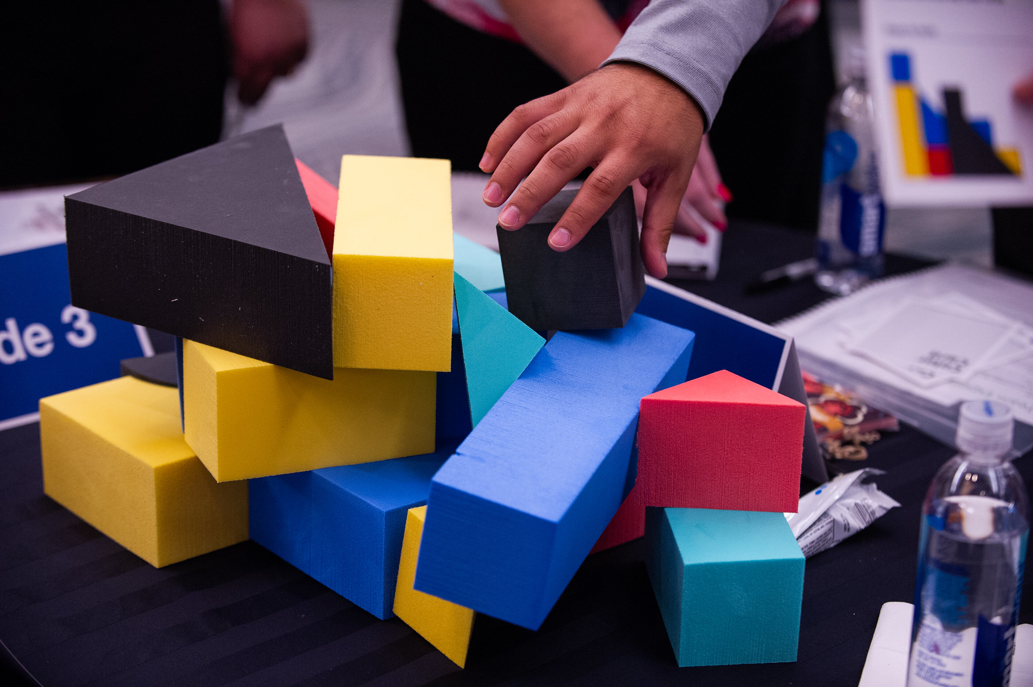
Drag in a two column layout and add a media-box--secondary class to the row.
This variation of the media box is intended to span the width of the screen, so make sure that you don't set this up inside another layout area with a max width.

Call to action
Add a two column layout block and add a call-to-action class on the wrapper.
Do something
Call to action
Add a two column layout block and add a call-to-action class on the wrapper.
Do somethingCuration Tiles
Drag in a 100% width layout and add a banded-bright section-inner class to the row and a container class to Column 1.
For creating a block-like treatment, first look at the number of rows you need (rows being dictated by complete lines of white space that span the entire treatment). Then, for each row, choose either a 33%+67%, 67%+33%, or a 33%+34%+33% layout element. In any case, name the wrapper class tile--banner .
In each column drag in a Tiles widget (under Curated Tiles, non-mvc). Chose to display 'one particular tile only'. Under Single Item Settings/ Detail Template, select Matrix - Single Tile. Small and medium tiles are reserved for columns of 33% or 34%, while large tiles are for 66%. Small tiles can be stacked in the same column.
Since 100% can't be divided three ways evenly, some alignment issues can arise. When creating this treatment, choose one column to apply the extra 1% to and stick with it throughout every row.
Suggested Image Sizes:
Small: 370px x 220px (360 x 265 for SMA)
Medium: 380px x 480px
Large: 760px x 455px (720x530 for SMA)
Using the iframe option will fill the area with the iframe and go over any other field. You can obtain embed codes from most video streaming sites such as YouTube and Vimeo. On YouTube, click on the share button under your video and copy the embed code into the iframe field. It is not recommended to use an iframe on a medium sized curation tile as it is taller than it is wide, making for a bad viewing aspect ratio.
NOTE: You must put an image in the image field. This image won't display, but this field must be filled in order for the tile to work.
NEW STEP
On Curation tile, go to Advance and then Model. Under ContentViewDisplayMode make it say Master and for DisableCanonicaURLMetaTag make it say True.
- Color BG, text only
- Image only
- Modal Content
Color BG, text only
This tile type just has the text in the content area and the title displayed, and doesn't link to anywhere. It should just be descriptive text that you want displayed and should probably be accompanied by other types of tiles.
Image Only
This tile type simply displays an image with no text or link.
Modal Content
This type has an overlay textbox with some text and a link to open a modal window with more information. There are new fields added to the Curation Tile module related to this, they should all be prefixed with "Modal" and have descriptive text explaining how to use them.
Curation Tiles New Colors
Images
Images now can be rounded on any place a content block is on the site, in order to do this you will have to manually add a div around the image inserted in the content block widget.
<div class="mg-image--circular" style="float: right; margin: 10px;"><img src="/images/default-source/photos-for-staff-use/product-scanning/picture19.tmb-large-350-.jpg?sfvrsn=f490406e_2"/></div>

<div class="mg-image--circular-noborder">{Image}</div>
Another method if you have the image in its own content block, click on advance and add the following class to the WrapperCssClass field:
mg-image--circular-noborder
This class would place the image in a circle of 250 pixels that has no borders

The following class would create a circle of 150 pixels with green borders
mg--circular-150
The following class would create a circle of 100 pixels with green borders
mg--circular-100


Image Placement
left aligned
choose image widget named: ImageLeft
or
use class left-aligned-inside

right aligned
choose image widget named: ImageRight
or
use class right-aligned-inside

centered
choose image widget named: ImageCentered
or
use class center-inside

Blog and News Cards
Add the Blog Post Widget or the News widget depending on what you want to show.
Drag in a column-100 column layout and add a section-2x class to the row and container in Column 1.
Into this layout element, drag in a Blog or news Posts MVC widget. Select "Use Limit" and set to 3 items total. Choose "Matrix blog post cards" as your "List template.
In the Single Item Settings, select existing page > Blog > View
Blog posts
Digital Engagement Is Transforming Grocery Shopping
News Cards
Drag in a column-100 layout and add a section-2x class to the row and container in Column 1.
Into this layout element, drag in a News MVC widget. Select "Use Limit" and set to 3 items total. Choose "Matrix news cards" as your "List template.
In the Single Item Settings, select existing page > Newsroom > Latest News > View
FMI Condemns Federal Regulatory Action on State Swipe Fee Reform
Online Grocery Sales Power Omnichannel Growth as Market Poised to Reach $452 Billion by 2028
Tile Banner
Generally used on landing pages.
Drag in a three column layout and add tile--banner and tile--row classes to the Row.
This variation of the tile-banner is intended to span the width of the screen, so make sure that you don't set this up inside another layout area with a max width.
In each column drag in a Tiles widget (Curation Tiles). Chose to display 'one particular tile only'. Under Single Item Settings/ Detail Template, select Matrix - Single Tile.
Resource Carousel
- add a column-100 layout block and give the row wide-carousel banded-secondary section-inner classes. Under Labels - Label column 1 'resources'.
- add two column-100 layout blocks to the new resource area (these should be siblings and not nested within each other). edit the first one and give the row a centered class. give column 1 a container class. Under Labels - Label column 1 'title'.
- on the second layout area give the row a title class. In column 1 add a container class. Under Labels - Label column 1 'resources widget'.
- drop a content block into the 'title' area and add some text for the carousel title.
- drop a resources widget into the 'resources widget' area. Please use a limit less than or equal to ~10. Choose Resource Carousel Circle in the List template settings.
If you want to embed a youtube or vimeo video instead of an image, add the embed code to the iframe field of the post. Add an image to the post as a backup too. You'll also need to add a summary description. It's best to re-size the video to 350x270 in the iframe code.
FMI Fresh Food Resources
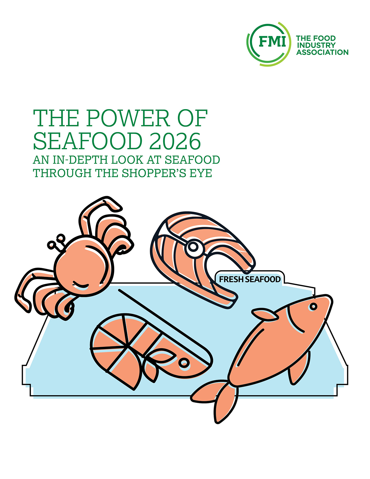
The Power of Seafood 2026
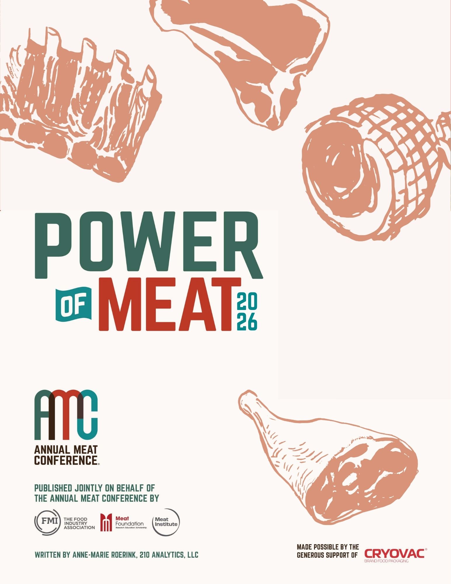
The Power of Meat 2026
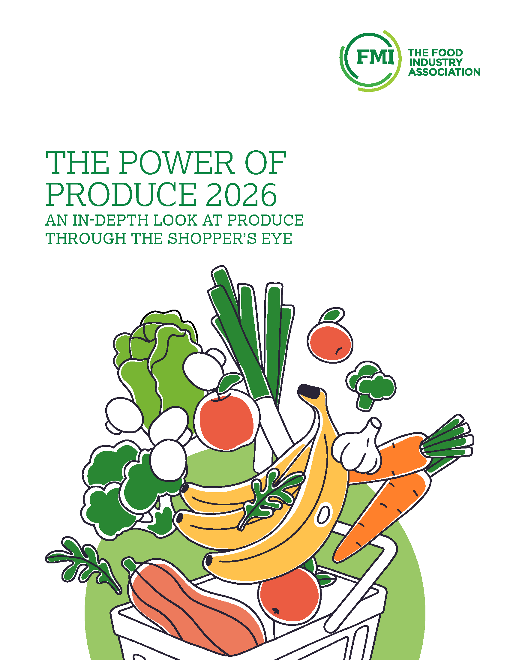
Power of Produce 2026
Grocery Shopper Snapshot: January 2026
2025 FreshForward Action Guide
Framework for Retail Foodservice Success
The Power of Foodservice at Retail 2025
The State of Fresh Foods 2025
The Food Retailing Industry Speaks 2025
U.S. Grocery Shopper Trends 2025: The Logic of Food Shopping
Forms
Icons
All icon spans must include an "fmi-icon" class in addition to the classes listed below. (e.g. <span class="fmi-icon fmi-icon-calendar"></span>)
Also, if you will be using the icon inline with some text next to it: use a 'spacer-left' or 'spacer-right' class like so:
<span class="fmi-icon fmi-icon-calendar spacer-right"></span> calendarSee all icons
Icon Sizes
To use various sizes of icon, just apply the class in the header of the table below. large-icon, medium-icon, and small-icon are the same as sizes 7, 4, and 2, just in easier to remember form. You don't need to include both the number size and easily remembered name for these. For example, if you want a large icon,you can add either one of large-icon OR icon-size-7.
Note that these won't really work with the icon badge below -- creating that circle needs a fixed size and so won't work well with these.
| Icon Sizes | icon-size-7, large-icon | icon-size-6 | icon-size-5 | icon-size-4, medium-icon | icon-size-3 | icon-size-2, small-icon | icon-size-1 |
|---|---|---|---|---|---|---|---|
Badge Icon
Add a icon-badge class to an icon to give it a white circular background.
Industry Topic Icons
Add a fmi-icon class and then the icon class name of the chosen topic icon.
Section / Page Icons
To edit/add section icons (the green circle with an icon that appears on most pages).
In the admin navigate to Content > Section Icons
Images with Captions

In the Alt Text field of your image, prefix your Alt Text with mg-caption: . The caption will be added automatically.
Use this code to center the image:
<style>
    .figimage {
        margin-left: auto;
        margin-right: auto;
        float: none;
    }
</style>
Attendee and Certificate Complete Lists
AllFields - This is just a copy of the existing one with name/company/title, named something simpler so it's easier to remember. https://www.fmi.org/sandbox/mailinglist-template---all-fields
AllFieldsWithLastInitial - This is the same as the above, but with last names cut down to last initials. https://www.fmi.org/sandbox/mailinglist-template---all-fields-with-last-initial
TitleAndCompanyOnly - This is the version initially discussed, with just title and company columns. https://www.fmi.org/sandbox/mailinglist-template---title-and-company-only
CompanyOnly - This shows the companies with only one row per company and an attendee count. https://www.fmi.org/sandbox/mailinglist-template---company-only
MAXX Categories
Here are the updated IDs for all Categories.
If the category is a "sub category" (i.e. nested under something else), the ID of its parent appears in the third column - otherwise this column says "NULL" and can be ignored. We included this because it is important for determining whether you're looking at the "Training & Development" (ID=20) which is its own top-level category or if you're looking at the "Training & Development" which is nested underneath Education.
"name": "Gene Editing" use: 70
"name": "General Marketing & Merchandising"
name": "Meat & Poultry"
<
"name": "Sustainability" - use: 9
Add and format new blog sections
Every blog section should consist of two pages: a list page and a detail page - this is necessary because post detail pages use a unique layout. To compose these sections do the following:
- Create a page which will contain the blog posts list. This page can use any page template you'd like.
- Create a page for the detail view and make this page a child of the first blog post list page. For this page use the page template called Mvc2020 View Page. In the page settings - set the page to NOT show in the site navigation.
- On the blog post list page - add a blog posts MVC widget and in list settings select Matrix Blog List for the list template.
- In the single item settings choose the option to open the single item in an existing page - choose the "view" child page you just made.
- On the view page - add a blog posts widet (NOT the MVC one). In the list settings choose Matrix - View Page Blog Posts for the list template.
- In the single items settings choose the open in 'Auto-generated page' option and select 2017 matrix full post for the detail template
Create maxx events sections
- add a Column-100 layout block and add inside of it the EventAreaGrid layout block.
- Add a content block to the 'events heading' area. The html structure should be:
<strong>Category Name</strong>
<div class="largest-text">Events</div>
- Add a content block to the 'events info' area and enter a description for the events.
- Add a maxx event widget to the 'Events widget here' area. In the widget options - add ~/Mvc/Views/mg-events-2017.ascx in the 'LayoutTemplatePath' option. In the 'MaxxCategoryIds' option add a taxonomy ID number if you want to filter events.
Simple events list
- Add a maxx meeting widget on a page.
- In the widget options - add ~/Mvc/Views/mg-events-2017_simple.ascx in the 'LayoutTemplatePath' option.
Thumbnail lists
- Drop in a list widget to the page, choose 'Expanded list' and select one of the list templates:
- Make sure the list you select only contains an image in the content of the list items.
mg-thumbnail-list--2-across
mg-thumbnail-list--3-across
mg-thumbnail-list--4-across
mg-thumbnail-list--5-across
Matrix - Title, Caption and Content
Matrix - Title and Caption
Linked Title
Sponsor Carousel
Sponsors







Linked Titles
Use the 'original url' field for the item link.
Matrix - Title and Caption
Use the caption field for the items' text.
Matrix - Title, Caption and Content
Use the caption field for the items' text.
Jumplinks
The example for this section works best on a two column page, so it has its own separate style guide page:
Event Microsite Events
To individually add events to a microsite page, start by adding a column-33-33-33 layout widget. In the row add class em-schedule__list and in each column field add em-schedule__item In each column drag in a Conference Sessions Widget and select "One particular conference session only..." and choose your session. In the Single Item Settings tab of the same widget, in the Detail Templates dropdown choose conference single form.
Event Cards
- Drag in a column-33-33-33 layout element.
- Add container equal-heights section push-down classes to the row.
- In each Column add event-card
- Optionally, in each column add title--color, where color is replaced with one of the banding colors above. You only need the color name. Not the full code.
- In each column, enter two content blocks. The top will be your title and the bottom your content. h3 is recommended for the title
Title
Lorem ipsum dolor sit amet, consectetur adipiscing elit. Donec feugiat magna nec nisl pellentesque vestibulum nec sed justo. Ut convallis felis a libero elementum venenatis.
Quisque eu congue erat. Aenean a urna ac velit imperdiet rhoncus vitae at leo. Proin aliquet congue risus et faucibus. Class aptent taciti sociosqu ad litora torquent per conubia nostra, per inceptos himenaeos.
Contact List Widget
Add the List widget to your content and select "Contact Staff" list, then on the template list item for the widget select "Staff Columns"
Professional Development Widget
This widget uses the content from a list in this case we are using the list called "Professional Development Programs"
-
Future Leaders is the industry’s premier training program for retailers, wholesalers, and suppliers. This interactive learning experience focuses on the development of leadership skills for professionals across the food industry. Learn More
-
Through a series of pre-work, skills challenges, on-the-job training activities and small-group discussions, participants build on the knowledge and skills gained through participating in the Future Leaders program to further expand their experience and apply what they learned. Learn More
-
The Retail Management Certificate is a community college academic program specifically tailored to develop the core competencies in business, marketing, management, technology, organizational behavior, communications, and finance necessary to be a successful grocery leader. Learn More
-
Future Leaders eXperience
Future Leaders is the industry’s premier training program for retailers, wholesalers, and suppliers. This interactive learning experience focuses on the development of leadership skills for professionals across the food industry. Learn More
-
Food Retail Leader Certificate
Through a series of pre-work, skills challenges, on-the-job training activities and small-group discussions, participants build on the knowledge and skills gained through participating in the Future Leaders program to further expand their experience and apply what they learned. Learn More
-
Retail Management Certificate
The Retail Management Certificate is a community college academic program specifically tailored to develop the core competencies in business, marketing, management, technology, organizational behavior, communications, and finance necessary to be a successful grocery leader. Learn More
Table
For tables please added the following class "certificates-table k-table"
<table class="certificates-table k-table">
| Timeframe | Cost | Location | |
|---|---|---|---|
| Future Leaders (Annual Event & Direct) | 3 day workshop | $500 | Orlando, FL |
| Food Retail Map Experience | 90 minutes per session | $500 | Orlando, FL |
| Food Retail Leader Certificate | 3 day workshop | $1500 | Orlando, FL |
| Retail Management Certificate | 90 minutes per session | $1500 | Orlando, FL |
Facts and Figures
Drag a Facts widget and select the category you wish to show, then on the list settings tab, limit it to 1, sort order by latest, and then select the template, here you will find the color the blue is the default Matrix Facts and Figures.
New List Templates
All of these use the MVC List widget, so if you don't see it listed, that's probably why.
Large Image with Text Beside
Pretty straightforward. Just create three list items with a title, some (preferably short) content, a link, and a primary image.

Tracking SNAP Waiver Requests & Approvals

Conditioning for a Growth Mindset in Grocery

U.S. Grocery Shopper Trends
Item Thumbnails With Detail
Create a list with 4-8 items. They need a primary and secondary image. The content will appear in the black overlay bar. Try not to make it too long or it may overflow... the area has to be a fixed height to allow for the image.
Staff Cards
Create a list with at least 5 people. The title should be the name displayed, the link field should be their email address, and the content should be the extra info (title, phone no.). The PrimaryImage field displays the image.
Special Join Us Button
This will display a button reading Join Us that opens a modal with different membership types. The list in this case is these items that show in the modal. The Title is the text of the button, and the link is the link it goes to.
Advance Layout Spacing
This layout block has "m--{size}'" class - which will add margins around the box.
| Class | Properties |
| m--0 | margin: 0; |
| m--1 | margin: 0.25rem; |
| m--2 | margin: 0.5rem; |
| m--3 | margin: 0.75rem; |
| m--4 | margin: 1rem; |
| m--5 | margin: 1.25rem; |
| m--6 | margin: 1.5rem; |
| m--7 | margin: 1.75rem; |
| m--8 | margin: 2rem; |
| m--9 | margin: 3rem; |
| m--10 | margin: 4rem; |
| m--11 | margin: 5rem; |
| m--12 | margin: 6rem; |
| m--13 | margin: 7rem; |
| m--14 | margin: 8rem; |
| m--auto | margin: auto; |
Add margin to a single side or to an axis
Control the margin on one side of an element using the m-{t|r|b|l|x|y}--{size} utilities.
For example, m-t--6 would add 1.5rem of margin to the top of an element, m-r--4 would add 1rem of margin to the right of an element, m-b--8 would add 2rem of margin to the bottom of an element, and m-l--2 would add 0.5rem of margin to the left of an element, m-x--8 would add a margin to the left and right of 2rem, m-y--10 would add a margin top and bottom of 4rem.
This layout block has "p--{size}'" class - which will add padding inside the box.
| Class | Properties |
| p--0 | padding: 0; |
| p--1 | padding: 0.25rem; |
| p--2 | padding: 0.5rem; |
| p--3 | padding: 0.75rem; |
| p--4 | padding: 1rem; |
| p--5 | padding: 1.25rem; |
| p--6 | padding: 1.5rem; |
| p--7 | padding: 1.75rem; |
| p--8 | padding: 2rem; |
| p--9 | padding: 3rem; |
| p--10 | padding: 4rem; |
| p--11 | padding: 5rem; |
| p--12 | padding: 6rem; |
| p--13 | padding: 7rem; |
| p--14 | padding: 8rem; |
| p--auto | padding: auto; |
Add padding to a single side or to an axis
Control the padding on one side of an element using the p-{t|r|b|l|x|y}--{size} utilities.
For example, p-t--6 would add 1.5rem of padding to the top of an element, p-r--4 would add 1rem of padding to the right of an element, p-b--8 would add 2rem of padding to the bottom of an element, and p-l--2 would add 0.5rem of padding to the left of an element, p-x--8 would add a padding to the left and right of 2rem, p-y--10 would add a padding top and bottom of 4rem.
LMS Swimlane Widgets
Add the correct styles to the containers.
Outer container put in the classes: wide-carousel banded-event-gray section-inner wide-carousel--no-absoulte to a column-100
Then nest a container that will have classes: centered section to a column-100
For the swimlane, add an embed code widget and add:
<div class="list-lms-webinar">
<list-lms-webinar v-bind:initial-data="{
listTitle: '',
cursor: 12,
schema: 'Product',
mode: 'dark-carousel',
type: 20,
categoryFilter: 113
}">
</list-lms-webinar>
</div>
*for the categoryFilter: put in any Category ID that corresponds to the category in MAXX
*for type: 20 is for On-Demand Digital Seminar, or put 21 for Learning Experience





.png?sfvrsn=89a4d009_1)
.png?sfvrsn=f10a00c_1)

.png?sfvrsn=beea939b_1)







.png?sfvrsn=43684ded_1)


---compressed.png?sfvrsn=f04efa67_1)
.png?sfvrsn=4a91db84_1)
.png?sfvrsn=51a7bec3_1)



 Industry Topics address your specific area of expertise with resources, reports, events and more.
 Our Research covers consumer behavior and retail operation benchmarks so you can make informed business decisions.
 Events and Education including online and in-person help you advance your food retail career.
 Food Safety training, resources and guidance that help you create a company food safety culture.
 Government Affairs work — federal and state — on the latest food industry policy, regulatory and legislative issues.
 Get Involved. From industry awards to newsletters and committees, these resources help you take advantage of your membership.
 Best practices, guidance documents, infographics, signage and more for the food industry on the COVID-19 pandemic.
